I recently attended talk on data visualization by Martin Krzywinski hosted by
VLSCI. Martin provided some great tips for presenting bioinformatics data (for some beautiful examples see
Martin’s website).
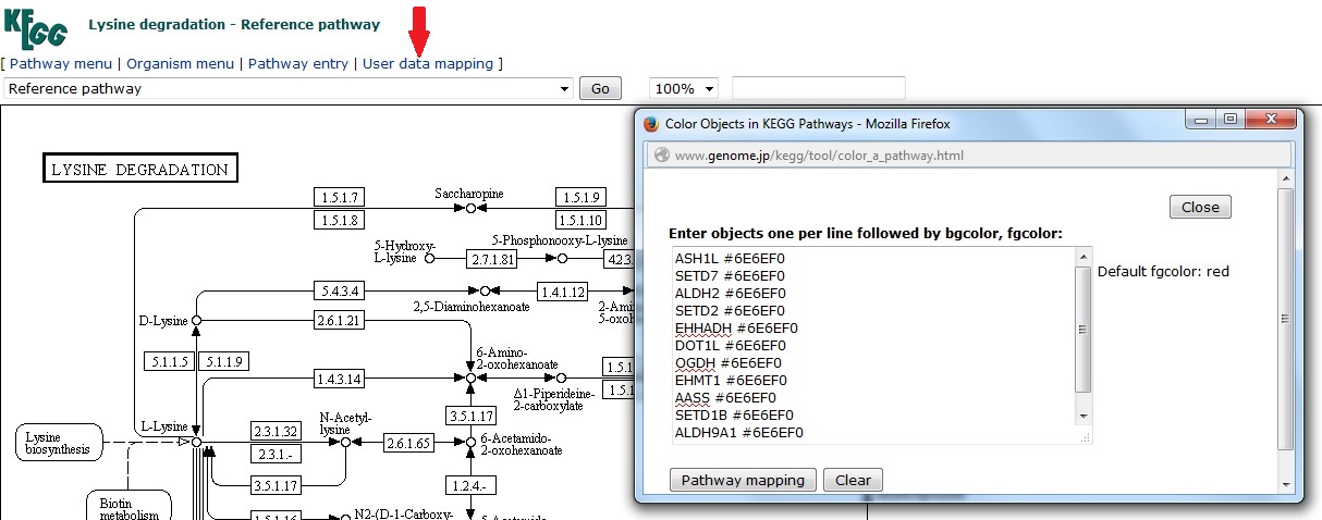
At the time I was trying to categorize lists of differentially-expressed genes into Gene Ontologies (GO) using
PANTHER and visualize them in a pie chart. Choosing an effective color palette to represent the 12 GO categories wasn't easy!
Martin recommended
Brewer Palates, created by cartographer Cynthia Brewer. These palettes provide color scales for qualitative, quantitative, and diverging variables. The
colorbrewer website is easy to use: simply choose the number of data classes and the nature of the data (qualitative, quantitative, or diverging). The resulting color scheme is provided in HEX, RGB, or CMYK, with an option to directly export a swatch into Photoshop or Illustrator. You can exclude options that aren’t color-blind, print, or photocopy safe (although not for 12 categories).
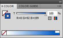
I was creating the pie charts in excel, so I entered the RGB values
directly in chart tools. I now use this chart template all the time.