
Sunday, 12 July 2015
Creating figures to depict enriched KEGG pathways: A first attempt
Gene set enrichment analysis (GSEA) of my microarray dataset implicated a number of KEGG pathways. I’m now exploring ways to create figures summarising the findings. In my last post I described mapping the core implicated genes (leading edge subset) from the analysis onto KEGG pathway diagrams. Although useful when interpreting the data, these figures are difficult to take in at a glance. In the figure below I’ve attempted to provide a stylized adaptation of the KEGG pathways to convey that many of the leading edge genes are involved in acetyl-CoA production feeding into the citrate cycle. It’s still not quite right, but getting there!

Wednesday, 1 July 2015
Mapping a gene list onto KEGG pathways
In a previous post I discussed using GSEA to identify enriched KEGG pathways in my microarray data-set. After running the GSEA leading edge analysis I had a list of the genes that contributed most to the enrichment score for each pathway. I then wanted to examine where these genes fell within the KEGG pathway. The ‘user data mapping’ function in KEGG Mapper is a nice tool to achieve this quickly.

Clicking ‘pathway mapping’ updates the reference to highlight the entered gene list. In this case it appears that my leading edge includes a sub-set of genes involved in methylation of histone lysine residues (in addition to the main pathway functions).

User data mapping
Select the ‘user data mapping’ option when viewing the reference KEGG pathway. In the pop-up window enter the gene symbols followed by the background and foreground color in hexadecimal numbers (if no color is specified the default is red).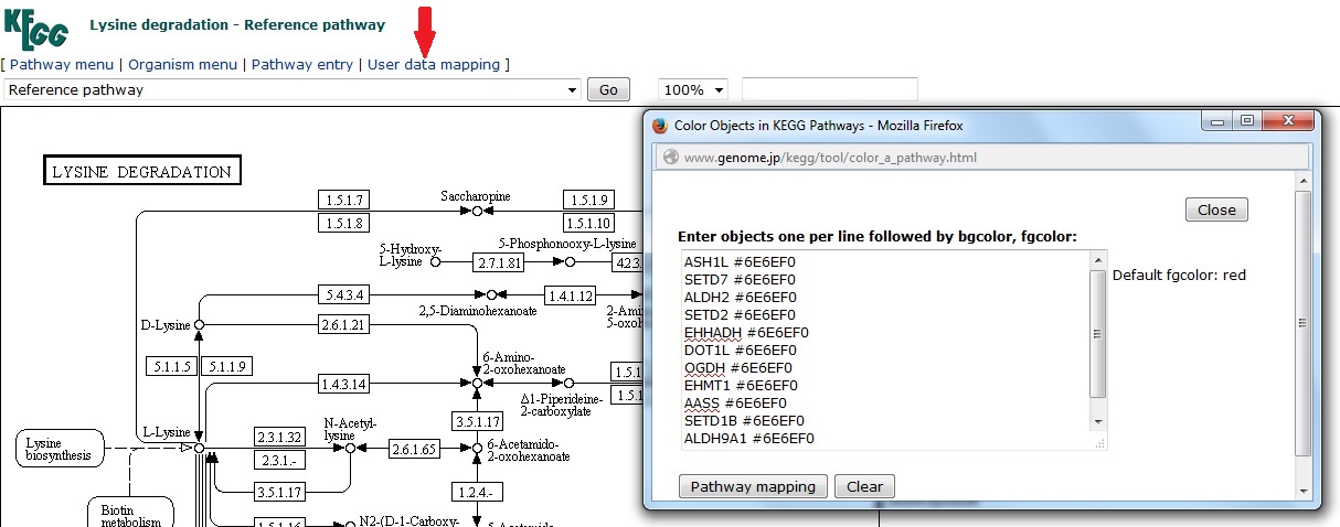
Clicking ‘pathway mapping’ updates the reference to highlight the entered gene list. In this case it appears that my leading edge includes a sub-set of genes involved in methylation of histone lysine residues (in addition to the main pathway functions).

Subscribe to:
Posts (Atom)